More of the right enquiries
Your site makes it clear what work you actually want, so better-fit customers get in touch.
If your website is vague, thin, or full of generic trade copy, it is costing you enquiries you should be getting. People land on the page, cannot tell what sort of carpentry you actually do, do not see enough proof, and leave. You do not need a flashy site. You need one that shows the right work, covers the right area, and makes it easy to ask for a quote.
Carpenter websites from £399, built to bring in better local enquiries.
A carpenter website should help you win better local work, not just sit there looking tidy.
Your site makes it clear what work you actually want, so better-fit customers get in touch.
Clear service and area structure helps your site show up for the searches that matter nearby.
Visitors can see the standard of your work quickly, without digging through vague copy or random photos.
A clearer quote path means fewer dead-end messages and fewer calls from people outside your scope.
Keep it simple, keep it clear, and build around the jobs you actually want.
Step 1
Send over your main services, target areas, and a few photos so the page is aimed at the jobs you actually want.
Step 2
You get a draft that makes your services, proof, and quote path clear enough to review quickly without technical back-and-forth.
Step 3
Once approved, the site goes live built to bring in clearer local quote requests instead of vague messages and poor-fit calls.
This is a demo carpenter website created by Kwise Web to show the standard and approach used for trade websites. It is an example project, not a live client business.
It should show clear services, real project photos, areas covered, reviews, and a quote form that asks useful questions. A visitor should understand within seconds what work you do and whether you cover their area.
Most carpenter websites vary by scope, but the key question is whether the site is built to rank and convert. A cheap site is not good value if it looks generic and brings in poor enquiries.
Yes, if it clearly shows your services, your work, and your coverage area. A better page helps both Google and potential customers understand why you are the right fit.
Usually, yes. Higher-value fitted work needs its own space so it does not get diluted by smaller repair or second-fix jobs.
Yes, if the page is built around real services, real locations, and clear internal structure. Google needs stronger signals than a gallery and a short paragraph.
Get a carpenter website that shows your work properly and brings in better enquiries.
If you want the deeper detail, this section explains what helps a carpenter website rank better and convert better in local search.
It covers service pages, project photos, coverage wording, page structure, and quote-form setup in plain English.
A lot of carpenter websites are built from the same trade template. They list a few services, add a short gallery, and hope that is enough. The problem is that this usually leaves the page too thin to rank and too vague to convert. Google does not get many clear signals about what sort of carpentry you do, and the customer does not get much help deciding whether you are right for their job.
That is where most of the missed opportunity sits. If the page does not make it obvious whether you handle fitted wardrobes, alcove units, kitchens, stair work, second-fix carpentry, doors, or repairs, it will struggle to match the way people actually search. Thin pages also tend to attract poor-fit enquiries because the visitor has not been guided properly before they contact you.
Carpenters and joiners usually cover a wider mix of work than many other local trades. A customer looking for fitted furniture is not thinking the same way as somebody who needs doors eased, skirting fitted, or timber repairs done. Even within joinery, the difference between bespoke fitted work and more practical carpentry can be large in terms of budget, lead time, and what the customer wants to see before getting in touch.
That means a good joiner website in the UK needs more than a generic gallery and a phone number. It needs to show what you actually want more of, what standard of work you do, and where you sit between bespoke craft-led projects and general local carpentry. If the page blurs all of that together, the right visitor hesitates and the wrong one still sends a message.
A good carpenter website should make life easier for both you and the customer. It should help the right person think yes, this is the sort of carpenter I need, before they ever ring or fill in the form. That starts with clear service sections. If you do fitted furniture, bespoke storage, media walls, stair work, doors, kitchens, second-fix carpentry, or repairs, those should not all be buried in one vague paragraph.
It also needs proper project proof, clear location coverage, reviews that mention workmanship and reliability, and a quote form that asks useful questions. Those basics do most of the work. When they are missing, the site feels generic. When they are done properly, the page becomes much easier for Google to understand and much more useful for someone comparing local carpenters.
If you want more fitted wardrobes, alcove units, staircases, kitchens, media walls, or bespoke storage projects, the site should lead with that work clearly. Do not make higher-value fitted joinery compete with a mixed list of small repair jobs if those are not the enquiries you most want. The page structure should reflect the commercial priorities of the business.
That does not mean smaller jobs have to disappear. Doors, second-fix work, timber repairs, and other practical jobs can still sit on the site, but they should be separated properly. A clearer split helps visitors self-qualify and gives you a better chance of being contacted by the kind of customer you actually want more of.
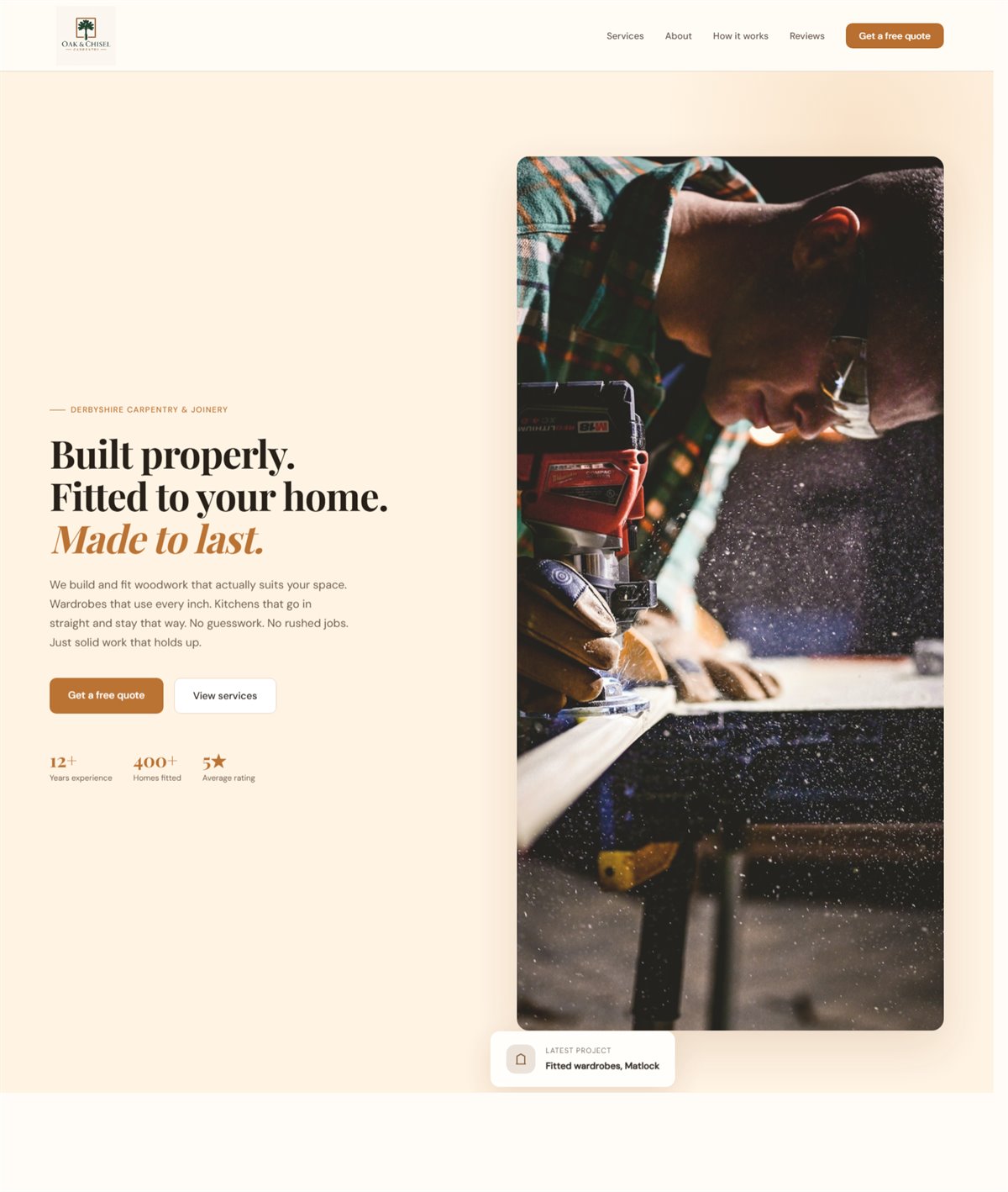
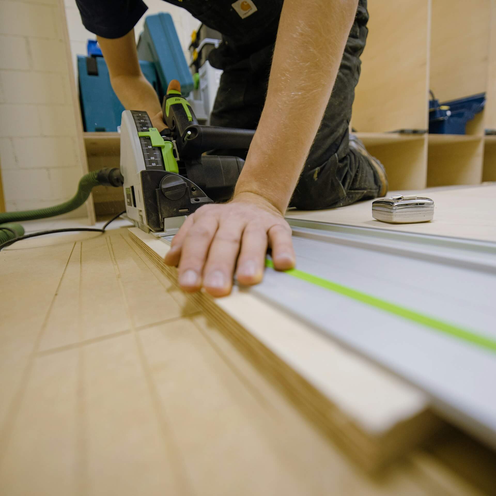
A gallery on its own is not enough. Project photos work harder when you explain what the job was, what room or setting it was in, what materials or finish were used, and what problem the work solved. That extra context helps the visitor picture their own project and gives the page more substance than a row of unlabeled images.
This matters a lot for carpentry because customers are often buying on trust and finish quality. A staircase project should not look like the same kind of proof as fitted wardrobes or kitchen joinery. Short captions and project summaries turn the portfolio into sales content instead of decoration.
Most carpenters serve a practical radius, not the whole UK. Your website should say clearly what towns, villages, and surrounding areas you cover, and that wording should sound natural rather than forced. The goal is to make it easy for a customer to tell whether you are local enough for their job, while also giving Google stronger local signals.
That local detail should line up with your contact information and your Google Business Profile. If the website, profile, and service wording all point in the same direction, it is easier to build trust and easier to support local search. Thin location pages with the place name swapped out are not the answer. Clear, believable coverage detail is.
Most established carpenters need more than one catch-all page. A practical structure usually includes a home page, a main carpenter or joiner page, key service pages, location pages for the towns that matter most, a project or gallery section, an about page, and a clear contact or quote page. That is enough structure to separate buyer intent without creating filler.
The right number of pages depends on the business. A carpenter focused on fitted furniture in one area may need a simpler structure than a joiner covering bespoke work, second-fix, kitchens, and several towns. The point is not to create pages for the sake of it. The point is to give each important search and each important service its own clear place on the site.
Before somebody gets in touch, they are usually trying to answer a few simple questions. Do you do this sort of work. Can I see similar jobs. Do you cover my area. Do you look reliable enough to trust in my home. Do you take on smaller jobs, larger bespoke work, or both. A good page answers those points before asking for the enquiry.
This is where plain English matters more than clever copy. The site should sound like it understands the work, not like it is trying to impress another marketer. Clear service wording, real examples, sensible reviews, and obvious contact details usually do far more than polished but empty claims.
A better quote form can save a lot of time. For carpentry, it helps to ask what type of job it is, where the customer is based, rough sizes if relevant, their timeframe, and whether they can upload photos. That gives you a much better starting point than a one-line message saying please can you quote.
These fields are especially useful for bespoke work because the first enquiry often arrives without enough detail to judge fit properly. A simple, well-judged form improves lead quality without making the page feel heavy. It also helps filter out poor-fit enquiries earlier, which is often just as valuable as generating more of them.
If you want the site to support visibility as well as conversion, compare this with how to make your website show up in your area and use both pieces to tighten the structure.
Use these supporting pages if you want to go deeper into pricing, structure, and local SEO.
A live carpenter and joiner example showing clearer service positioning, project-led proof, and stronger quote paths.
A detailed guide on service pages, galleries, reviews, local coverage, and quote forms for carpenters.
Useful if you are deciding whether a carpenter site needs separate service and location pages.
Explains the local SEO basics that matter when your work depends on nearby searches.
Shows how your website and Google listing should work together to win local enquiries.
Use the pricing guide to judge what sort of carpenter website structure is realistic for your budget.
These nearby service pages help support the wider trade cluster.